Introduction to Tome and the Need for Alternatives
The Rise of Visual Storytelling in Presentations
In a world where every detail counts, visual storytelling in presentations has become king. Gone are the days when bullet points reigned supreme oday's audiences crave narratives that spring to life with each click.
Stunning graphics, compelling animations, and interactive elements are not just nice to have; they are expected. This transformative shift pushes presenters to seek tools that can deliver such dynamic experiences.
Why Seek Alternatives to Tome in 2024?

As we navigate through 2024, the landscape of digital presentation tools continues to evolve, offering a myriad of options tailored to different needs and preferences.
While Tome has been a popular choice for its advanced features and customization capabilities, it may not be the perfect fit for everyone.
Some users are finding it too complex or time-consuming for their needs, leading them to explore other tools that prioritize ease of use, quick creation, and a more intuitive interface.
In this blog post, we'll delve into the reasons why you might consider seeking alternatives to Tome and highlight some excellent options available today.
Top Tome Alternatives (The Ultimate List)
Alternative #1: Decktopus AI
Revolutionizing Content Creation with AI-Powered Assistance

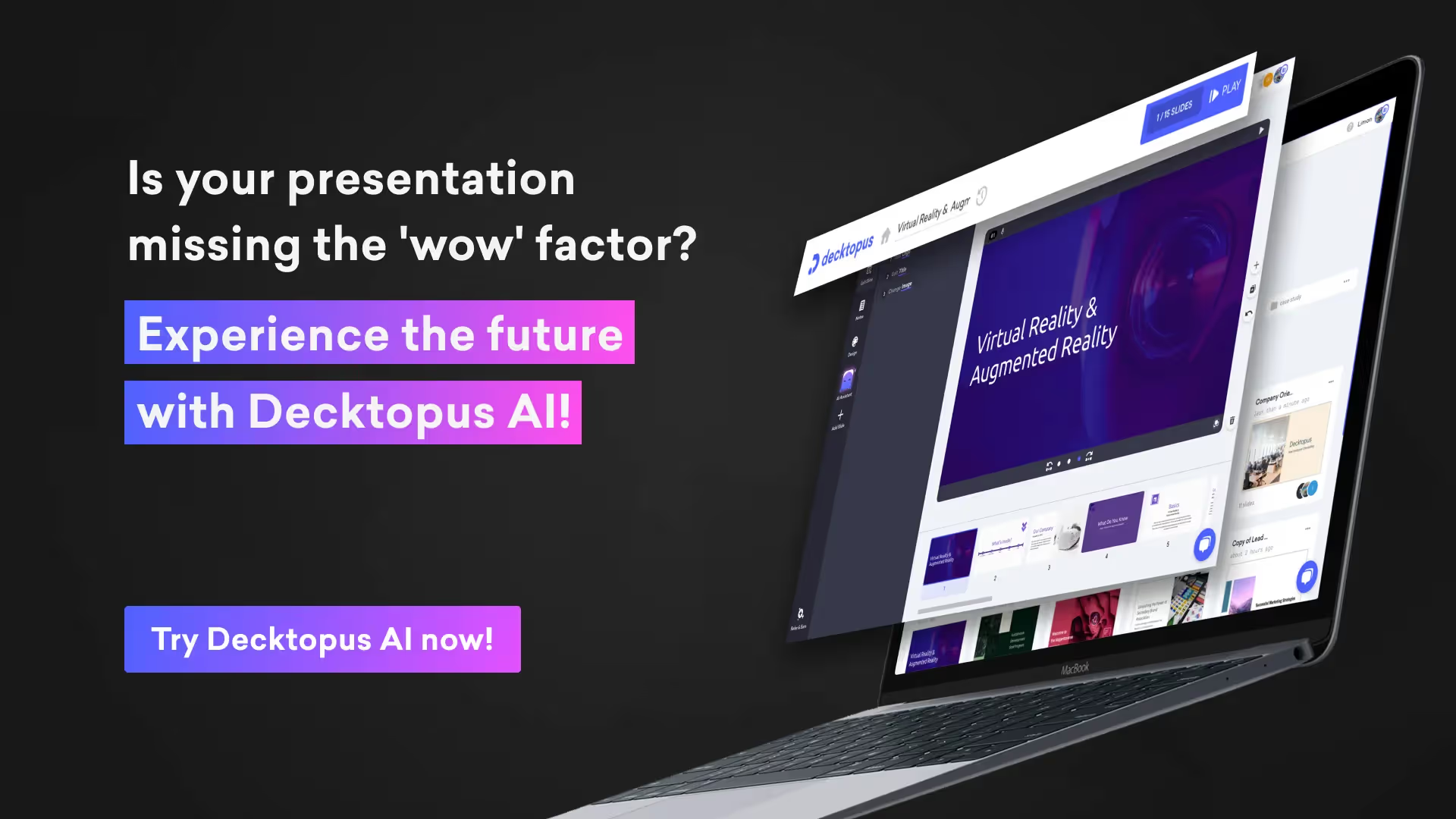
Decktopus AI stands out as a game-changer in the world of presentation software, leveraging artificial intelligence to streamline the content creation process and enhance the quality of presentations.
Its AI-powered engine acts as a virtual assistant, empowering users to generate fully designed decks tailored to their needs effortlessly.
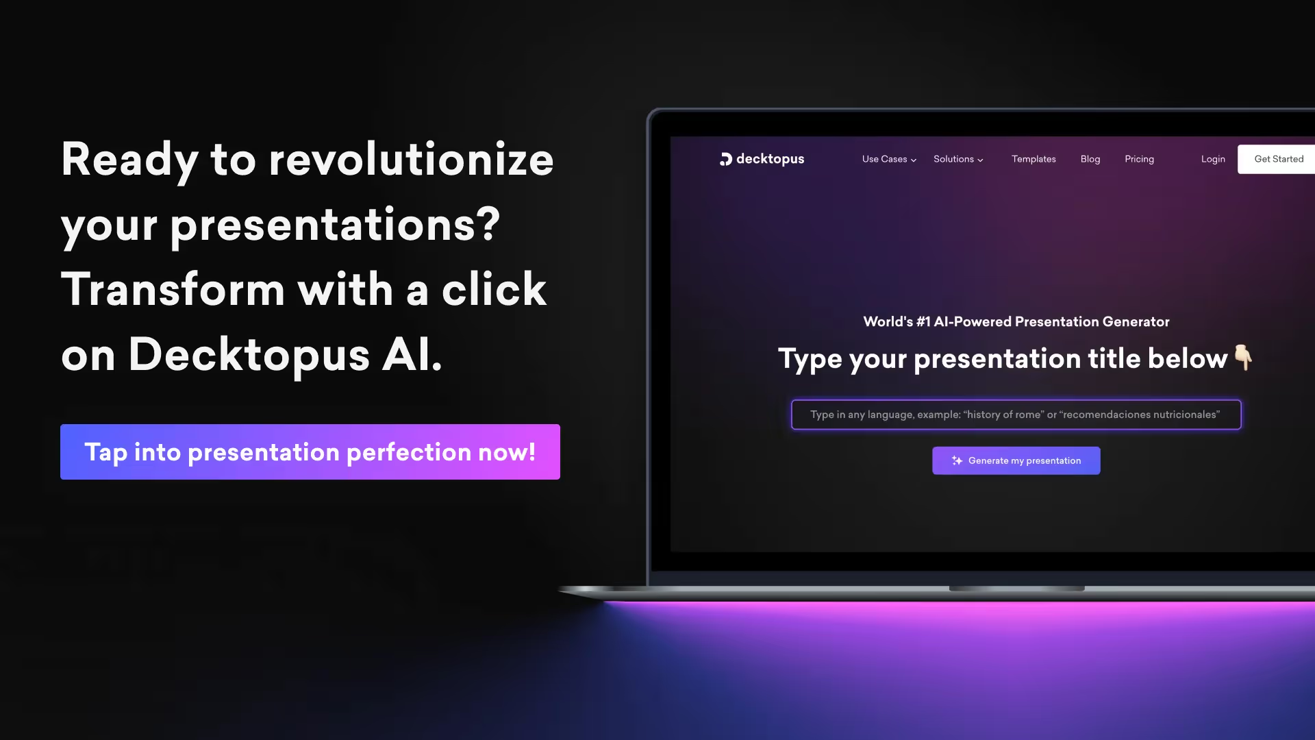
By simply entering the topic of their presentation, Decktopus AI analyzes the content and provides content suggestions, eliminating the dreaded writer's block and ensuring a smooth workflow.
This innovative approach not only saves time but also enhances creativity, allowing users to focus on delivering impactful presentations.
Dynamic Image Generation for Engaging Visuals

One of the standout features of Decktopus AI is its ability to generate high-quality, relevant images on the fly, revolutionizing visual storytelling.
Say goodbye to the time-consuming process of searching through stock photo libraries; Decktopus AI automatically generates dynamic images that complement the content of the presentation.
Whether it's a business graph, a conceptual illustration, or a stunning background image, Decktopus AI ensures that visuals are as engaging and compelling as the content itself. This not only enhances the overall presentation but also captivates the audience and leaves a lasting impression.
Tailored Content Suggestions and Personalized Assistance
Decktopus AI goes beyond simple content generation; it provides users with tailored content suggestions and personalized assistance throughout the presentation creation process.
From crafting authentic narratives to refining storytelling techniques, Decktopus AI offers guidance and support every step of the way.
Users can infuse personalized icebreakers, hooks, and story-like structures into their presentations, ensuring that each slide resonates uniquely with the audience.
Additionally, Decktopus AI provides dynamic Q&A sessions tailored to address audience queries, seamlessly integrating them into the presentation flow for effortless audience engagement.
Effortless Collaboration and Cloud-Based Convenience

Decktopus AI fosters a spirit of collaboration by offering built-in collaboration tools that facilitate seamless teamwork and project management. Users can categorize presentations, invite team members to collaborate in real-time, and track changes effortlessly.
With its cloud-based platform, Decktopus AI ensures convenience, versatility, and peace of mind.
Presentations are saved automatically and can be accessed from any device with an internet connection, allowing users to work anytime, anywhere.
This eliminates the need for cumbersome file transfers and ensures that teams stay connected and productive, even when working remotely.
Decktopus surpasses Tome in several key aspects, making it a superior choice for creating presentations.
With its more sophisticated AI-powered content creation engine, Decktopus eliminates the hassles of manual content creation, allowing users to generate fully designed decks tailored to their needs effortlessly.
Unlike Tome, Decktopus offers instant dynamic image generation, ensuring that visuals are engaging and relevant without the need for extensive searches through stock photo libraries.
Additionally, Decktopus boasts a user-friendly interface and a wide range of customizable templates and themes, allowing users to create visually stunning presentations with ease.
Its collaboration features and cloud-based platform further enhance productivity and convenience, making it the preferred choice for professionals seeking efficiency and creativity in their presentations.
Overall, Decktopus's innovative features and streamlined workflow make it a much better option than Tome for creating impactful and engaging presentations.
Discover Decktopus AI's vast template library!

In conclusion, Decktopus AI is not just another presentation tool; it's a powerful ally for professionals, educators, and creatives looking to unlock their full potential.
With its AI-powered assistance, dynamic image generation, tailored content suggestions, and seamless collaboration features, Decktopus AI revolutionizes the way presentations are created and delivered.
Whether you're a seasoned presenter or a novice, Decktopus AI empowers you to craft compelling stories that captivate audiences and drive meaningful engagement.
Pros and Cons of Decktopus AI
Pros:
- Ease of Use: Decktopus offers a user-friendly interface and intuitive tools, making it accessible to users of all skill levels.
- Time Efficiency: With its AI-powered content creation engine, Decktopus streamlines the presentation creation process, saving users time and effort.
- Visual Appeal: Decktopus provides a variety of visually appealing templates and themes, allowing users to create professional-looking presentations effortlessly.
- Collaboration: Decktopus offers built-in collaboration features, enabling teams to work together in real-time, regardless of location.
- Consistency: Users can maintain brand consistency across presentations with Decktopus, ensuring a cohesive visual identity.
Cons:
- Learning Curve: Some users may need time to familiarize themselves with Decktopus' features and interface, particularly if they are new to the platform.
However, Decktopus provides extensive support through Decktopus Academy, where users can access courses covering various aspects of presentation creation and delivery.
These courses include topics such as utilizing Decktopus AI assistance, optimizing presentations through PDF importing, and mastering customization techniques.
Additionally, Decktopus Academy offers courses to help users upgrade their stage presence, ace business meetings, and achieve their goals effectively, providing comprehensive training resources to enhance users' presentation skills and confidence.

Organizational Chart for B2B
A unique feature of Decktopus V2 is its organizational chart functionality, designed specifically for B2B users. This allows companies to visually represent their organizational structure, which is crucial for business presentations.
Use Cases for Different User Segments
Decktopus caters to a wide range of users:
- Business Professionals: Create engaging pitches, reports, and proposals.
- Teachers: Design interactive lessons and educational materials.
- Artists: Showcase portfolios with visually appealing layouts.
Other use cases of Decktopus AI include: Sales Professionals, Marketing Managers, Account Executives, BDRs, Founders, Agencies, Webinars & Conferences, Customer Support & Success Executives, and Vocal Decks.
Comparison with Tome
When comparing Decktopus and Tome, it becomes clear they cater to different user preferences in the realm of digital presentation tools. Tome distinguishes itself with its extensive customization options, making it an ideal choice for professionals and designers who prioritize control over every aspect of their presentations.
Users can meticulously adjust layouts, incorporate interactive elements seamlessly, and integrate with various third-party tools to create highly tailored and sophisticated presentations.
This level of flexibility and depth in customization makes Tome particularly suited for industries like marketing, where presentation aesthetics and functionality are crucial for engaging audiences effectively.
On the other hand, Decktopus shines with its intuitive interface and emphasis on simplicity. Designed with ease of use in mind, Decktopus leverages AI technology to streamline the content creation process significantly.
Users can start with a basic topic input and rely on Decktopus to generate fully designed presentations complete with relevant templates and dynamic visuals.
This approach not only saves time but also enhances creativity by reducing the complexities typically associated with presentation design. It's an excellent choice for educators, small businesses, and professionals who need to produce polished presentations quickly without extensive design skills.
In summary, while Tome offers unparalleled customization capabilities for users who require intricate control over their presentations, Decktopus excels in accessibility and efficiency, making it a standout option for those seeking a straightforward yet powerful tool to create impactful presentations.
For more detailed comparisons, you can check out these links:
Alternative #2: Microsoft PowerPoint
The Old-School Choice

Microsoft PowerPoint continues to be a juggernaut in the presentation software arena, offering features that can take any pitch from drab to dynamic. They boast a wide array of customizable templates, intricate animation capabilities, and the ability to embed diverse forms of media.
Collaboration and Cross-Platform Compatibility

PowerPoint's embrace of the collaborative spirit is evident in its smooth integration with OneDrive, SharePoint and other Microsoft apps, allowing teams to work simultaneously on presentations, ensuring everything stays in data sync.
It doesn’t matter if team members are using Windows, Mac, or a multitude of mobile devices; PowerPoint’s cross-platform format compatibility ensures that collaboration barriers are virtually non-existent.
Alternative #2: Prezi
The Non-Linear Pathway to Dynamic Presentations

Prezi flips the script on traditional slide-by-slide storytelling by offering presenters a sprawling canvas where ideas can be interconnected in a non-linear fashion in its website. This allows the audience to see the bigger picture literally, grasp complex relationships, and follow a more organic train of thought.
It's perfect for brainstorming sessions, strategic analyses, or any scenario where the journey from point A to B isn't a straight line but an explorative path.
Prezi's unique approach means ideas don't have to be constrained by order or hierarchy, freeing presenters to create a more dynamic, memorable experience.
Engaging Audiences with Zooming User Interface

Prezi's signature zooming user interface is a game-changer for maintaining audience engagement. As the presenter zooms in on details and out to reveal context, it keeps viewers on the edge of their seats, much like a cinematic experience.
This motion creates emphasis and connection between topics, showing how the micro and macro are woven together.
It's an ideal tool when they want their audience not just listening but interacting with the presentation's landscape. Prezi's ability to turn a passive experience into an immersive journey can make all the difference in capturing and keeping their attention.
Alternative #3: Keynote
The Go-To for Mac Users Seeking Sleek Design Options

For the design aficionados in the Mac community, Keynote is akin to finding their visual soulmate in presentation software. It's tailored to enhance the aesthetics of their content with its sleek design options.
Keynote dazzles with its array of high-quality templates that exude a polished Apple aesthetic, making each slide appear like it was crafted by a designer.
The intuitive interface allows Mac users to wield advanced graphic tools with ease, elevating their presentations into captivating stories. With Keynote, anyone can morph their ideas into visually striking narratives that resonate with elegance and creativity.
Seamless Integration Across Apple Devices

Keynote truly shines when it comes to integration across the full spectrum of Apple devices. Users can start crafting their presentation on a Mac, add finishing touches on an iPad, and present from an iPhone with practiced ease.
The continuity features are smooth as silk, and with the ability to control presentations using an Apple Watch, it's clear that Keynote is designed for a seamless, interconnected Apple ecosystem.
This unparalleled compatibility means that one's work can travel with them effortlessly, ensuring they're always primed to present with style, no matter the Apple device in hand.
Alternative #4: Canva
Simplifying Design for Non-Designers

Canva levels the design playing field, empowering those without a background in graphic design to create stunning presentations.
Its user-friendly interface coupled with a vast library of customizable templates turns complex design tasks into simple, enjoyable activities. Just a few drag-and-drop actions can yield professional-looking results that make the content shine.
Canva's thoughtful approach to design simplifies the process so anyone can convey their message with visual flair, making it an alluring choice for non-designers aiming to captivate their audience with minimal effort.
Extensive Library of Templates and Visual Assets

Canva's extensive library of templates and visual assets is a veritable treasure trove for creating eye-catching presentations.
Creative freedom is at the fingertips with thousands of design options, from sleek and professional to bold and playful. They can indulge in an array of fonts, images, illustrations, and even videos that bring their slides to life.
Plus, with easy-to-use design elements and animations, Canva ensures that every presentation delights and informs. Whether presenting to a classroom or boardroom, Canva has the assets to make the message resonate.
Alternative #5: Zoho Show
Collaborative Features for Team-Centric Presentations

Zoho Show excels when teamwork is at the heart of the presentation process. Its collaborative features foster a spirit of partnership, allowing team members to contribute and refine content, no matter where they are.
Real-time co-authoring, commenting, and chat functions mean ideas can flow freely and be shaped collectively.
Teams can track changes, revert to previous versions, and ensure that everyone has a hand in the final product. For those who believe that great ideas are born from collaboration, Zoho Show is a tool that brings teams together to craft compelling stories.
Cloud-Based Convenience and Versatility
Zoho Show shines with its cloud-based platform, offering convenience, versatility, and peace of mind. Presentations are saved automatically and can be accessed from any device, anywhere, all they need is an internet connection.
This means goodbye to the days of flash drives and frantic email attachments before meetings.
With features like real-time collaboration and the ability to broadcast presentations to remote participants, Zoho Show is designed for the modern, mobile, and connected workforce. Its versatility extends to integration with various platforms, making it a nimble tool for a variety of professional environments.
Making the Switch: Transitioning from Tome
Importing Existing Content into New Platforms
Transitioning to a new presentation platform doesn't mean starting from scratch. Many alternatives offer smooth importing capabilities, allowing users to bring in their existing Tome content with ease. This bridges the gap between the old and the new, ensuring that hard work isn't left behind.
By simply uploading a file or sometimes even using a dedicated import tool, slides can be revitalized within a new environment, complete with the opportunity to enhance them using fresh features. This means they can spend more time innovating and less time recreating.

Learning Curves and Community Support
Every new tool comes with its learning curve, but the ascent is often softened by the presence of robust community support and extensive resources. Some alternatives to Tome offer tutorials, forums, and customer service to help users master their features and troubleshoot issues.
An active community or user base can provide practical tips, while official training sessions and documentation can offer structured guidance. Embracing a new platform does require some acclimatization, but users are rarely alone in their journey—support is often just a click away.
For example, Decktopus stands out with its innovative Decktopus Academy, a comprehensive resource hub designed to empower users with in-depth knowledge and skills.
Through Decktopus Academy, users can access tutorials, guides, and training sessions covering various aspects of presentation creation and delivery.
Whether it's mastering the AI-powered content creation engine or enhancing stage presence, Decktopus Academy offers structured guidance to help users navigate the platform with confidence.
With Decktopus Academy's support, users can elevate their presentations and unlock their full creative potential all while seamlessly mastering the tool's features.

The Comparative Edge: Usability, Features, and Support
Evaluating User Experience Across Platforms
When it comes to evaluating user experience across different presentation platforms, you're looking at a variety of factors. Does the interface invite you in, or do you feel overwhelmed just thinking about where to start?
How smooth is the learning curve? Are there helpful tutorials and customer service at the ready for when you hit a snag?
- Consider platform-specific navigation and how intuitive it is for a new user.
- Gauge the responsiveness of each application, noting any lag or bugs.
- Assess the availability and quality of templates and tools to help you get started quickly.
- Look closely at the collaboration features - can you easily work with others, and how does the platform handle changes and feedback?
- Examine the export and sharing options; how many steps does it take to get your presentation to your audience, and in what formats can you share it?
For a stellar user experience, the platform of choice should strike the right balance between simplicity and functionality, remaining agile for quick tweaks while also being powerful enough to allow for in-depth customization.
Exploring reviews and testimonials can provide real-world insights into how these platforms perform when put to the test.
Assessing Unique Features That Differentiate Each Tool
While scouting for the best Tome alternative, it's crucial to zero in on the unique features that set each tool apart. Because let's face it, in a sea of presentation platforms, you want the one that not only ticks all the right boxes but also brings something special to the table.
- Investigate how each platform handles multimedia integration, from video embedding to interactive charts.
- Look for standout elements, like AI design assistance or advanced data visualization tools.
- Check for unique collaboration options does the platform allow for anonymous feedback or integrate with project management tools?
- Delve into customization possibilities, considering everything from theme adjustments to the ability to code your own templates.
- Pay attention to built-in analytics and feedback collection capabilities that can help you measure the impact of your presentation.
The tools that stand out usually have that one killer feature or a unique bundle of capabilities that not only complement the standard fare but take your presentations up a notch, potentially transforming your workflow and end product.
Frequently Asked Questions (FAQ):
1) What is better than Tome?
When looking for a robust alternative to Tome in 2024, Decktopus emerges as an exceptional choice for anyone seeking a streamlined and intuitive presentation creation experience.
While Tome offers extensive customization options, Decktopus excels in simplicity and efficiency. Decktopus leverages AI-powered assistance to automate the design process, making it incredibly user-friendly even for beginners.
Unlike Tome, which can be complex and time-consuming with its deep customization capabilities, Decktopus allows users to create professional-looking presentations effortlessly.
Whether you're a marketer, educator, or business professional, Decktopus offers a diverse range of templates, dynamic image generation, and collaborative features—all designed to enhance productivity and creativity without the steep learning curve.
2) Is there a free AI like Tome?
While Tome offers advanced AI-powered features for presentation creation, finding a free alternative with comparable capabilities can be challenging.
However, Decktopus stands out as an accessible option that combines AI technology with a user-friendly interface. Although Decktopus offers both free and premium plans, its free version provides substantial AI assistance, allowing users to generate presentations efficiently without upfront costs.
This makes Decktopus a practical choice for those looking to harness AI for content creation without committing to a paid subscription immediately. Unlike Tome's primarily paid model for full AI functionality, Decktopus offers a balanced approach, ensuring users can benefit from AI-driven design suggestions and templates at no cost.
3) Is Tome better than Canva?
When comparing Tome and Canva for creating presentations, the choice depends on your specific needs and preferences. Tome excels in offering extensive customization options and advanced features suitable for detailed and sophisticated presentations.
However, for users prioritizing ease of use and versatility, Canva may be more appealing.
Canva provides a wide range of design tools and templates that cater to various design projects beyond presentations, including social media graphics, posters, and more.
In contrast, Tome's focus remains on delivering powerful presentation features, making it ideal for users needing comprehensive customization and control over their presentation design.
4) Which is better, Tome, Decktopus, or Gamma?
In the realm of presentation software, the choice between Tome, Decktopus, and Gamma ultimately depends on your specific requirements. Tome excels in customization and detailed control over presentation elements, making it suitable for professionals who demand intricate design capabilities.
However, Decktopus offers a compelling alternative by prioritizing simplicity and efficiency through AI-driven assistance. Decktopus enables users to create polished presentations quickly with minimal effort, making it ideal for educators, small businesses, and teams needing to collaborate seamlessly.
Gamma, on the other hand, focuses on data-driven visualizations and analytics, catering to users who prioritize data presentation and analysis.
Therefore, the best choice among Tome, Decktopus, and Gamma hinges on whether you prioritize customization, ease of use, or data visualization in your presentations.
5)Tome AI free or paid?
Tome's AI features are primarily available through its paid subscription plans, reflecting its focus on professional users who require advanced tools for presentation creation.
In contrast, Decktopus offers a blend of free and premium features, including AI-powered assistance, to cater to users of all levels.
While Tome's paid model ensures access to extensive customization and AI capabilities, Decktopus provides essential AI-driven features in its free version, allowing users to benefit from automated design suggestions and templates without initial financial commitment.
This accessibility makes Decktopus a versatile choice for individuals and teams looking to leverage AI technology for creating impactful presentations without upfront costs.

.svg)
.svg)
.svg)


.svg)


.avif)


.svg)
.svg)
.svg)
.svg)
.svg)
.svg)
.svg)
