Pitch Deck
Top 10 Pitch Deck Mistakes Startup Founders Should Avoid in 2026
Avoid the 10 most common pitch deck mistakes that cost startup founders funding, and build an investor-ready deck fast with Decktopus AI.


Decktopus Content Team
Table of Contents
What Is a Startup Pitch Deck?
Why Pitch Deck Mistakes Cost You Funding in 2026
The 10 Pitch Deck Mistakes Founders Keep Making
Mistake vs. Fix: Quick Reference Table
The 7-Step Investor-Ready Pitch Deck Framework
Real-World Examples: Decks That Got It Right
Common Mistakes to Avoid When Fixing Your Deck
How to Build Your Pitch Deck with Decktopus AI
Frequently Asked Questions
Conclusion
Stay Connected
What Is a Startup Pitch Deck?
A startup pitch deck is a concise presentation founders use to walk investors through their business, covering the problem, the solution, the market, the team, and the ask. Its main benefit is simple: it turns a complex business idea into a story an investor can evaluate and act on in minutes, not hours.
According to CB Insights research on startup failure, running out of cash and failing to raise new capital account for 38% of startup shutdowns, and a poorly built pitch deck is very often the first domino in that chain. Investors see hundreds of decks a year and make an initial read on most of them in under four minutes, so the difference between a fundable idea and a passed-on one frequently comes down to execution, not the idea itself.
This guide breaks down the ten pitch deck mistakes that quietly kill fundraising rounds, gives you a repeatable framework to avoid them, and shows exactly how to build an investor-ready deck with Decktopus AI.

Why Pitch Deck Mistakes Cost You Funding in 2026
Fundraising in 2026 is more competitive than it was even two years ago. LinkedIn's Global Talent Trends research has repeatedly shown that decision makers, including investors, form durable first impressions within the first few minutes of any pitch, which means small deck errors compound fast. A cluttered slide or a missing financial projection does not just look unpolished, it signals a founder who has not thought rigorously about their own business.
Understanding the most common mistakes is the fastest way to avoid them. Below, each mistake includes what it looks like in practice and the specific fix experienced fundraisers use.
The 10 Pitch Deck Mistakes Founders Keep Making
1. Too Many Slides
When it comes to a winning startup pitch deck, less is more. One of the biggest mistakes founders make is cramming in too many slides. The sweet spot is under 20, and for most seed-stage decks, closer to 10 to 12.
PayPal co-founder Peter Thiel's 10/20/30 rule remains a useful guideline: 10 slides maximum, 20 minutes to present, and a 30-point font minimum. This is not only about brevity, it is about clarity. Investors review dozens of decks weekly, and a bloated deck sends the wrong message before they read a single word.
2. Too Many Words Per Slide
Wordy slides are just as damaging as having too many of them. A common pitch deck mistake is trying to say everything on one slide, often with dense paragraphs and font sizes below 12 points. Investors do not want to read blocks of text, they want insights they can absorb in seconds.
Keep slides scannable: use bullet points instead of paragraphs, stick to short and impactful phrases, limit text to key takeaways, and lean on visuals like charts, infographics, or product screenshots. A strong pitch deck is visually driven, not text-heavy, and it should support your story rather than narrate it word for word.
3. Poor Layout and Design
Design can make or break a pitch deck. It is not only about aesthetics, it is about the first impression. One of the most overlooked pitch deck mistakes is a cluttered, inconsistent, or amateur layout, and with investors reviewing 10 or more decks a day, a sloppy one rarely gets a second look regardless of how strong the underlying idea is.
Stick to a few core design principles: consistent margins across every slide, two to three font sizes maximum for visual hierarchy, one cohesive color palette, high-quality images or icons, and consistent alignment throughout. Always export your final version as a PDF to preserve formatting so it never breaks on someone else's machine.
4. Lack of Storytelling
Startups that pitch with data alone miss the emotional connection that actually moves investors to act. Investors do not just fund ideas, they fund people and purpose, so a deck that skips the "why" is skipping the part that makes it memorable.
Three story angles work consistently well: the founder's journey (why you started this company and what problem you personally saw), the customer perspective (how the product solves a real, felt problem), and the market context (why now is the right moment to solve it). We remember stories, not stats, so your deck should walk investors through a clear narrative arc.
5. No Traction or Market Validation
Investors fund momentum as much as they fund ideas. A critical mistake is failing to include any evidence of traction, whether that is early revenue, pilot customers, waitlists, partnerships, press mentions, or beta tester feedback.
If you are still pre-launch, show how the idea is being validated through surveys, prototype feedback, or early demand signals. The goal is proving that you are building something people actually want.
6. No Clear Financial Projections or Business Model
A pitch deck with vague or missing financial projections is one of the biggest red flags for investors. It signals poor planning, or worse, a lack of business clarity. Your deck needs a simple, credible financial model outlining projected growth and the assumptions behind it.
At minimum, include three to five year revenue projections, burn rate and runway estimates, basic unit economics like CAC and LTV, a breakdown of major cost drivers, and the key assumptions your model depends on. Avoid an unrealistic hockey-stick chart with no supporting logic. Investors can spot one instantly, and it damages trust rather than building it.
7. Not Including a Clear Funding Ask
Surprisingly, many founders forget the most essential part of the pitch: the actual ask. Your deck should tell investors not just what you are building, but exactly what you need to take it further, including how much capital you are raising, the intended use of funds, expected runway, equity or valuation range, and preferred investment terms such as a SAFE, equity, or convertible note. A vague or missing ask signals a lack of preparation more than anything else in the deck.
8. Claiming a Lack of Competitors
Telling investors there is no competition raises red flags, not capital. Every legitimate market has competitors, even if only indirect ones, and claiming otherwise usually signals either a lack of research or a market that does not actually exist.
Acknowledging competition shows you understand the industry landscape, proves there is real demand for your solution, and helps investors assess your positioning. Include a competitive matrix, name key players and how you differ, and clearly state your unfair advantage in technology, speed, team, or intellectual property.
9. Relying on Jargon or Unexplained Acronyms
Filling slides with industry jargon or unexplained acronyms is a common and entirely avoidable mistake. Even if your product is technical, your pitch needs to be clear enough for a non-expert investor to grasp immediately, because confusion kills interest fast.
Avoid technical jargon unless absolutely necessary, spell out acronyms the first time you use them, use plain language wherever possible, and add short explanations for genuinely complex terms. The goal is to sound credible, not complicated.
10. Not Displaying Contact Information
Imagine delivering a strong pitch, only to lose investor interest because they cannot find a way to reach you afterward. Your final slide should include your full name and title, email address, phone number, LinkedIn profile or website, and optionally a scheduling link for a follow-up call. Do not assume anyone will dig through an email signature to find your contact details. Make following up effortless.
Mistake vs. Fix: Quick Reference Table
Mistake | Why It Hurts You | The Fix |
|---|---|---|
Too many slides | Signals unclear thinking, wastes investor time | Cap at 10 to 20 slides using the 10/20/30 rule |
Dense, wordy slides | Investors skim, dense text gets skipped entirely | Bullet points, short phrases, visuals over paragraphs |
Inconsistent design | Reads as unprofessional before content is even judged | One color palette, two to three font sizes, consistent margins |
No storytelling | Data alone does not create emotional buy-in | Lead with founder journey or customer problem narrative |
Missing traction | No proof the market wants this | Include revenue, signups, partnerships, or testimonials |
Vague financials | Signals poor planning | 3 to 5 year projections with clear assumptions |
No funding ask | Leaves investors without a clear next step | State amount, use of funds, and terms explicitly |
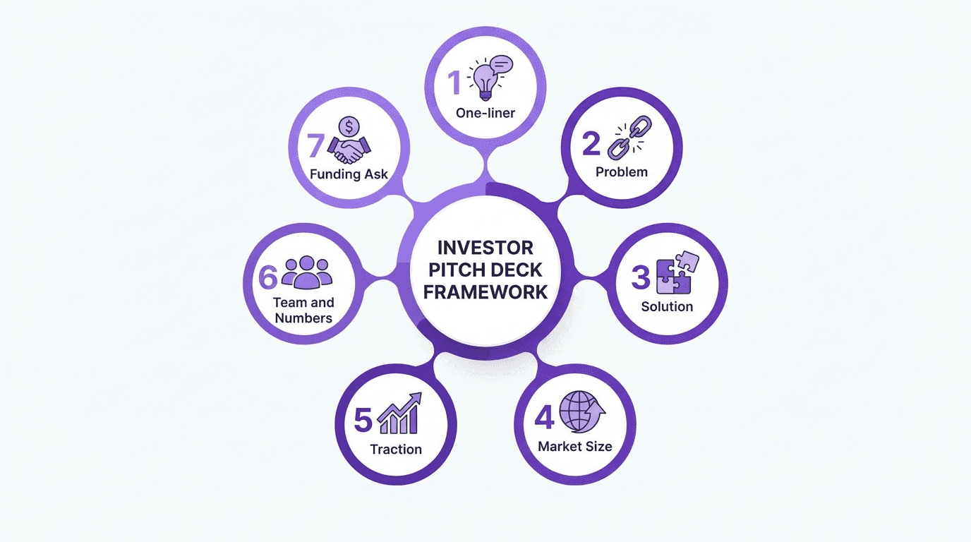
The 7-Step Investor-Ready Pitch Deck Framework
Use this framework as a build checklist before you send any deck to an investor.
Open with a one-liner. State what you do and why it matters in a single sentence.
Define the problem sharply. Make the pain point specific and relatable, not abstract.
Present your solution clearly. Show, do not just tell, how your product solves it.
Size the market with real data. Back your opportunity claim with credible market sizing.
Prove traction. Revenue, users, partnerships, or validated demand signals.
Show the team and the numbers. Who is building this, and what do the unit economics look like.
Close with a specific ask. Amount, use of funds, and terms, stated plainly.
Real-World Examples: Decks That Got It Right
Airbnb's original seed deck is one of the most studied examples in startup history precisely because it violates none of the ten mistakes above: it is short, visually simple, and leads with a clear problem and market opportunity before asking for anything. You can see how that structure translates into a modern format in our Airbnb pitch deck breakdown.
A useful pattern across decks that raised successfully: the strongest slide in the deck is usually the traction slide, not the product slide, because it answers the investor's real question first, which is whether anyone besides the founder actually wants this.
Common Mistakes to Avoid When Fixing Your Deck
Over-correcting into a wall of charts. Adding traction and financial data is important, but do not replace one form of clutter with another. Keep each slide to one core idea.
Rewriting the deck without rehearsing it. A cleaner deck still needs a founder who can present it confidently. Practice the narration, not just the slides.
Ignoring the version investors actually see. Export and test your final PDF on a different device before sending it. Formatting breaks are common and entirely preventable.
Sending a static deck when a live one would serve better. If you are iterating quickly, a shareable live link that updates automatically saves you from resending outdated attachments.
How to Build Your Pitch Deck with Decktopus AI
Fixing these ten mistakes by hand, slide by slide, in PowerPoint or Google Slides is slow and easy to get wrong under fundraising pressure. Decktopus AI is built to structure, design, and refine a fundable pitch deck around exactly the framework above, without you needing design skills.
Why Decktopus AI Is Built for Fundraising Decks
AI Presentation Generation turns a short description of your startup into a structured outline first, then a full deck, so you start from a clean structure instead of a blank slide.
AI Outline Generation lets you review and edit the section order (problem, solution, market, traction, ask) before any slides are generated, so the story arc is right from the start.
Brand Import via URL pulls your company's colors, typography, and logo directly from your website, so your deck looks consistent with your brand without manual design work.
Edit with AI lets you refine specific slides with natural language, for example "tighten this financial slide to three bullet points," with a preview before anything is applied.
AI Image Generation and the built-in Unsplash and Freepik library give you high-quality visuals instead of generic stock photos or clip art.
Loop AI Delivery Coach gives you real-time feedback while you rehearse your pitch, addressing the storytelling and confidence problems, not just the slide design.
Version History keeps every past version of your deck, so you can experiment with different narrative angles without losing earlier drafts.
Decktopus AI vs. Traditional Tools for Pitch Decks
Task | PowerPoint or Google Slides | Decktopus AI |
|---|---|---|
Initial structure | Manual, starts from blank or generic template | AI-generated outline reviewed before full deck |
Brand consistency | Manually matched to brand guidelines | Brand imported automatically from company URL |
Editing under time pressure | Manual formatting fixes slide by slide | Edit with AI applies natural language changes with preview |
Sharing updates with investors | Re-export and re-send new file each time | Live link auto-updates at the same URL |
Rehearsal feedback | None built in | Loop AI Delivery Coach gives real-time feedback |
Who This Section Is For
This workflow is built for founders preparing seed or Series A decks, and for teams that need a deck ready in days, not weeks.
Step-by-Step: Build Your Pitch Deck with Decktopus AI
Describe your startup. Type a short description like "seed-stage SaaS tool for construction project management" or upload existing notes and an old deck via the paperclip icon. If you have an outdated deck, Decktopus AI's Beautify feature can either use it as a resource to build a new deck, or redesign it while keeping your existing text and structure.
Choose your style. Import your brand directly from your company website URL, apply a previously saved style, or let AI generate a style from scratch if you do not have one yet.
Review the AI-generated outline. Decktopus AI produces a section-by-section outline first. Edit the order, titles, or section count so the problem, solution, market, and ask flow logically before you generate full slides.
Generate the full presentation. Once you approve the outline, Decktopus AI produces the complete deck with content, layout, and design applied.
Refine with Edit with AI or Edit Text. Use Edit with AI for prompts like "make the financial slide more concise" or "add a competitive matrix to this slide," with a preview before applying and undo always available. Use Edit Text for direct manual edits. Every change is tracked in unlimited version history.
Add images. Generate custom AI images from a description, upload your own product screenshots, or pull from the built-in Unsplash and Freepik library.
Rehearse with Loop AI Delivery Coach. Practice your pitch inside Decktopus AI and get real-time feedback on your delivery before the real meeting.
Export or share. Export to PDF, PPT, or PNG in Standard or Compressed quality, share a live link that updates automatically as you refine the deck, embed it on your site, or present directly from Decktopus AI's full-screen Presentation Mode. Business plan users can also connect a Custom Domain for a branded live-link experience.
Get started with Decktopus AI and build your next investor pitch deck around a structure that avoids all ten of these mistakes from the outset.
Frequently Asked Questions
How many slides should a startup pitch deck have?
Most successful seed and Series A decks stay between 10 and 20 slides, following Peter Thiel's 10/20/30 rule as a general guideline.
What is the biggest pitch deck mistake founders make?
Overloading slides with too much text and too many slides is the most common mistake, followed closely by missing or vague financial projections.
Do I need a financial model if I am pre-revenue?
Yes. Even pre-revenue startups should include projected growth assumptions, burn rate, and runway estimates to show investors you have thought through the business model.
Should I claim my startup has no competitors?
No. Every market has competitors, even indirect ones. Acknowledging them and clearly stating your differentiation builds more credibility than claiming there is none.
What should the funding ask slide include?
The amount you are raising, intended use of funds, expected runway, and preferred investment terms such as a SAFE, equity, or convertible note.
What tools can I use to build a pitch deck?
Founders commonly use PowerPoint, Google Slides, or AI-powered platforms like Decktopus AI, which generates a structured deck automatically from a short description.
How long should I spend on my pitch deck design?
Design should not become a bottleneck. Most founders spend too much time on visual polish and too little on the underlying story, financials, and traction data.
What is the 10/20/30 rule?
A guideline from Peter Thiel: 10 slides maximum, 20 minutes to present, and a 30-point font minimum for readability.
Should I include contact information on every slide?
No, one clear closing slide with your name, title, email, and LinkedIn is enough. Do not clutter earlier slides with repeated contact details.
How do I show traction if I have no revenue yet?
Use waitlists, signups, partnerships, press mentions, or validated demand signals from surveys and prototype feedback.
Can I use jargon if my product is highly technical?
Keep jargon to a minimum even for technical products. Define any acronym the first time you use it and prioritize plain language throughout.
What file format should I send investors?
Always export your final deck as a PDF to preserve formatting, or share a live link that stays current if you are still iterating on the content.
How is Decktopus AI different from using a template?
Decktopus AI generates the full structure, content, and design from a short description rather than starting from a static template you fill in manually.
Conclusion
Every one of these ten mistakes is preventable, and most of them come down to the same root cause: rushing the story and the numbers to focus on visual polish instead. A pitch deck that keeps its slide count tight, tells a clear story, backs itself with real traction and financials, and closes with a specific ask will consistently outperform a beautifully designed deck that skips those fundamentals.
Before you send your next deck to an investor, run it against this list one more time. Then build or refine it with a tool structured around exactly this framework, so the story and the design work together instead of fighting each other.
Stay Connected
Follow Decktopus for more presentation tips and product updates:
Related posts

The Ultimate Guide to the Best AI Pitch Deck Generators: Free and Paid Options for Creating Stunning Pitch Decks
Discover the best AI pitch deck generators to streamline creating decks for investors. Ideal for entrepreneurs and startups, these AI tools help craft the perfect pitch deck effortlessly.
Pitch Deck
Top 10 Best AI-Powered Pitch Deck Generators For Founders
Discover the best AI pitch deck generators for founders. Compare top tools that generate investor-ready decks in minutes, apply your brand automatically, and let you focus on the pitch instead of the design.
Pitch Deck

Early Stage Entrepreneur Hack: Talking to Users
You have your idea and you have your pitch deck. You knock on some doors, pitch the idea, and even though your pitch deck looks stunning, the investor is not sure about the idea. They want to see the transactions first. What a bummer!
Pitch Deck